Graphic Reboot
By Karen Robichaud, guest contributor
Today MCA went live with a re-envisioned firm identity package, designed and executed in-house. The package includes a new domain name, website, graphics, and stationery. Today’s launch is the culmination of four months of designing, thinking, iterating, and producing, while handling ongoing project work. I sat down with MCA’s founder, Mark Careaga, to hear about the thought process that went into the rebrand.
What prompted this effort, and why now?
The catalyst was a mundane problem. Our original domain name, mcarq.co, wasn’t available in the dot-com version – it belongs to an architecture firm in Valencia, Spain. My first rookie mistake in starting the firm was failing to realize that emails mistakenly sent to the dot-com version of my email address would end up in Valencia, most likely in their spam folder, and without any bounce-back notification to the sender. This became a recurring problem, and when it happened again last October, I decided it was time to do something about it. So, I registered marcararc.co and marcararc.com as the new domain names for the firm, with the intent of using the former as the primary domain and setting up the dot-com version to forward to the dot-co.
How did you come up with marcararc.co?
One evening after several hours in front my laptop with a good cocktail nearby. One fundamental parameter was the name had to be available in both dot-co and dot-com. I already knew from when I started the firm that mca.com was unavailable – it’s owned by Universal Music and redirects to their website. And I didn’t want to go with a hyphenated name like mc-arch.co – I find those harder to type. I thought markcareagaarchitect.com seemed like too much to type, and my last name is commonly misspelled.
So given all that, I simply took the first three letters of each word in the firm name and strung them together, like proteins in a DNA strand. I spent a little time playing with it typographically to see how it looked on screen, thinking ahead to how it would work for firm identity materials like letterhead and business cards. It felt right, and when I saw that it was available in both dot-co and dot-com, I registered them on the spot.
Why not save some money and just go with a dot-com?
I prefer how dot-co looks typographically, and I associate “com” with “commercial,” whereas “co” signifies “company,” at least to me. A distinction without a difference, perhaps.
Tell us about the new logo.
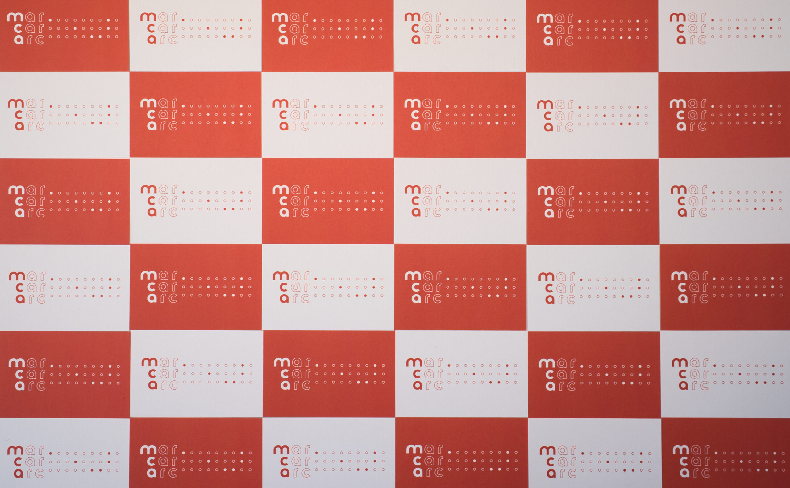
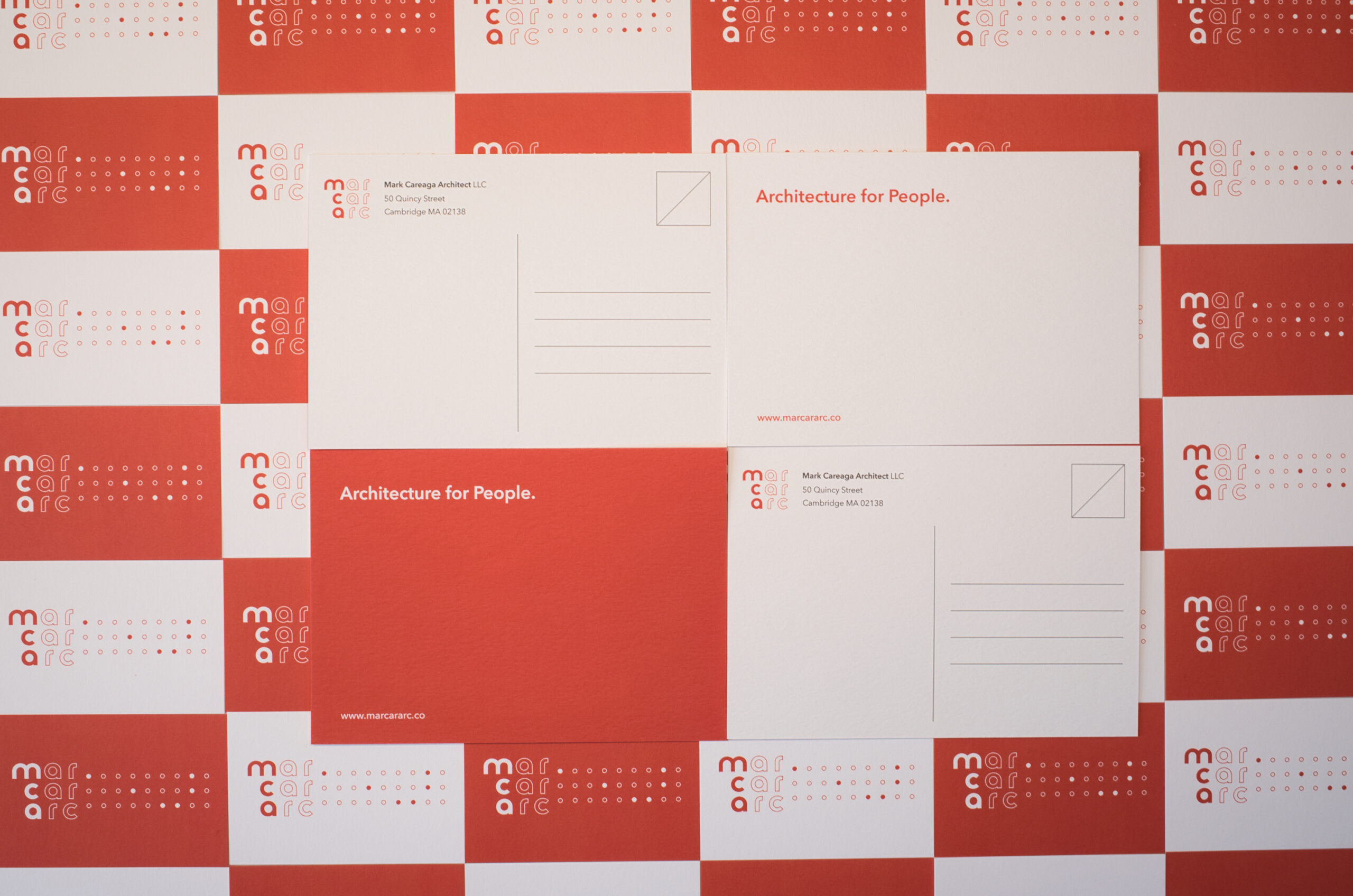
After registering the new domain name, I quickly realized that the logo design could do two things at once: convey the short name of the firm, “MCA,” while simultaneously embodying the website domain name. I suppose this is a bit of rhetorical sleight of hand, but I was drawn to the idea that someone could say, “What’s with the domain name? Oh, I see, it’s the logo,” and vice versa.
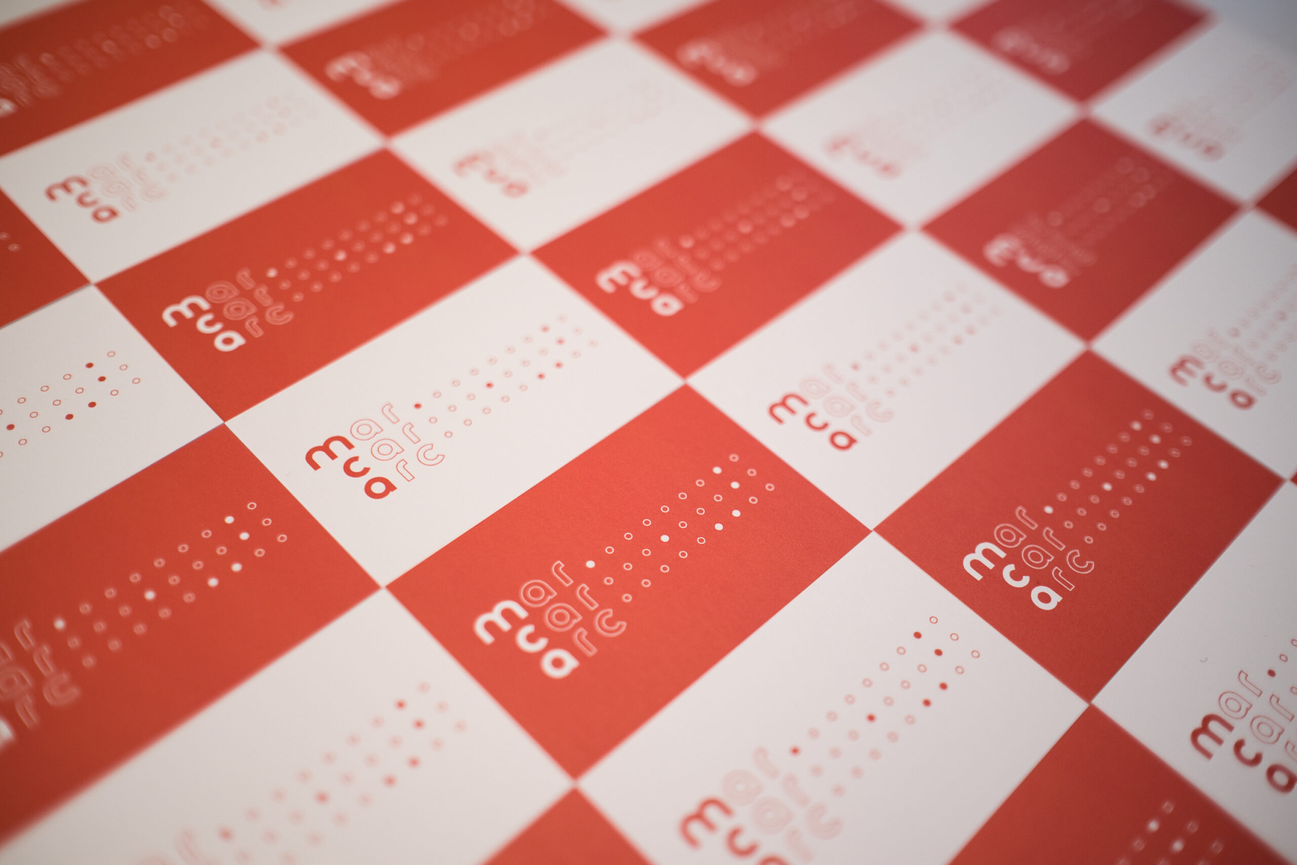
More importantly, I wanted the logo’s design to be visually and typographically appealing. I used a slightly modified version of Reross Quadratic, which Adobe published among a series of new typefaces based on designs produced at the Bauhaus. Using the classic nine square grid, I organized the letters of the domain name into the grid, taking cues from the geometries of the letterforms themselves. I decided to let the triplets – “mar,” “car,” and “arc” – read horizontally in three rows and graphically emphasize the first letter in each so that “mca” would read vertically. I tested the idea of having “mca” read horizontally, but that weakened the visual link to the domain name. And I chose all lowercase in part because that is how the domain name will naturally appear in a browser tab but also because the lowercase letter forms in the Reross Quadratic have very pure circular geometries, which I found attractive visually. It was a case of finding a typeface that is well suited for the design intent.
Design iterations / typographic explorations
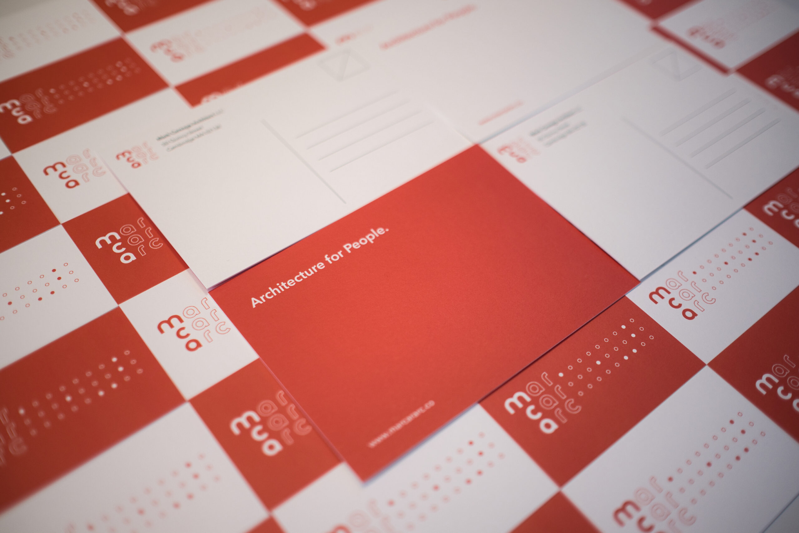
I see you have some new stationery.
Yes, I’m old school and still value giving and receiving physical business cards, though I do have a custom digital card with QR code in the Wallet app on my iPhone. My first business cards when I started in 2019 were custom letterpress, which I love and planned to use again but decided is too expensive. I retained most of the original typography (using Avenir Next) for things like name and address, and as before, I put the new logo on the back of the card. Since the logo is square-ish, I added a dot pattern, which expresses continuation of “mar,” “car,” and “arc” like ellipses, but also encodes “mca” in a subtle way.
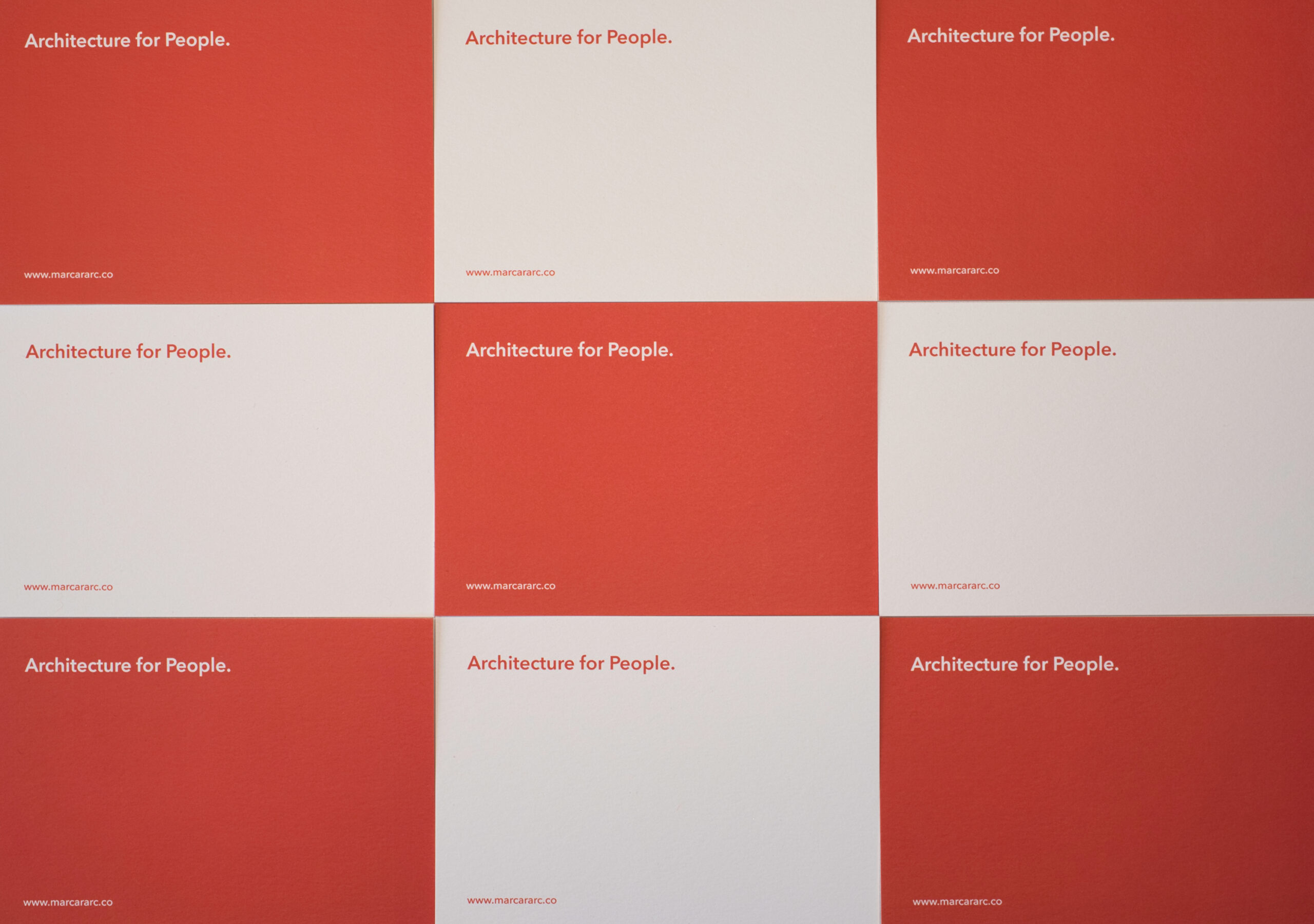
Once I decided to forego letterpress printing, I went to MOO for production. I’d seen their work and liked that they had the European business card size as a standard offering. And they have thick “luxe” cards which are similar to the feel of letterpress but without debossing. They also let you specify multiple designs for the backside at no additional charge, which was a great way to use the MCA red as a field color with the logo in white – the new website similarly inverts the logo depending on what’s in the background.
We’ve talked a lot about graphic design and domain names, now tell me about the website design.
I hope readers will have an opportunity to explore the site when reading this interview. You and I initially talked about designing a custom website, but that’s a big investment, in time and expertise, neither of which I have in abundance – or in money to hire someone to do custom coding. So going with an existing WordPress theme was the best option – I knew enough about working in WordPress that this would be mostly in my comfort zone.
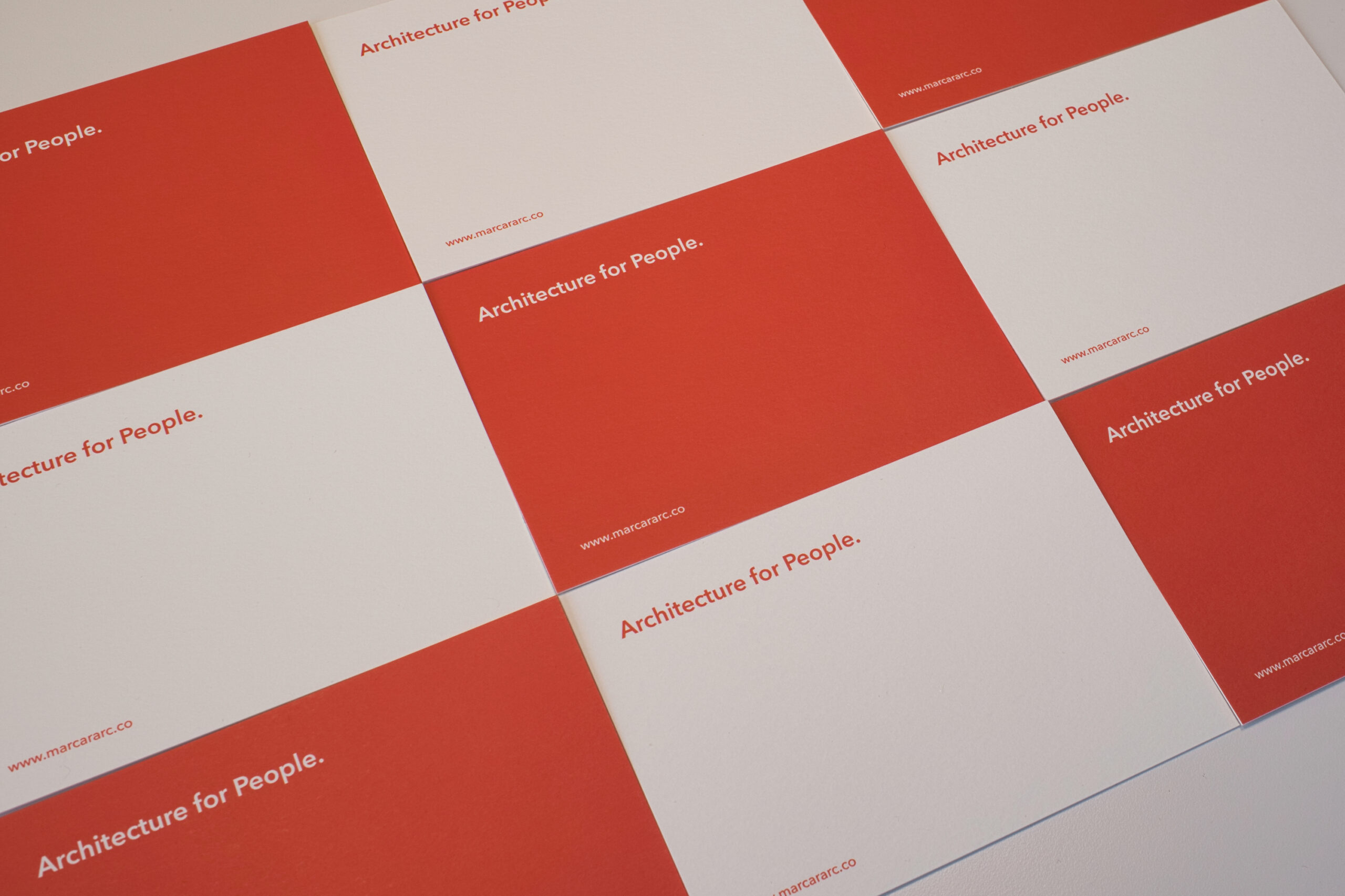
I found an elegant theme called Antro, by ClaPat Studio. Based on their demo, I could see that it would do what I wanted, and the prepackaged design was a good fit for MCA. And the folks at ClaPat were super helpful about providing support on some technical issues. The design of the site itself was a process of simplification – three menu items: Portfolio, Practice, and Perspectives – and developing content around the theme of Architecture for People. Once I got used to the WordPress block editor and the theme’s CSS parameters, the authoring and production were rather fun.
Final thoughts?
This rebranding effort was a daunting task, especially for a very small firm like MCA. Even though I was involved in Payette’s website redesign effort in 2018, I hadn’t appreciated how much work goes into these kinds of efforts. But it was very rewarding and stimulating work, and MCA now has website that will serve us well as we grow and evolve over the next several years. And thank you for being my strategic communications consultant, as well as copy editor and occasional therapist. It was great to work with you again, and I look forward to future collaborations!
Karen Robichaud is a strategic communications consultant working with architects and designers to tell their stories and strengthen their message.
Milly Baker at 13.20, 1 March 2022 -
Love your new website and glad to see the finished pictures of Nairobi. It appears that you have survived the pandemic and are thriving. Good luck
Shahab at 01.21, 9 March 2022 -
Right steps Mark; I am impressed by your thought process in rebranding MCA, hopefully your business will now not land in Valencia ?
Paula Buick at 17.07, 14 March 2022 -
I really enjoyed this conversation between you and Karen. I really like your 3P – especially Perspectives. Your clarity and understanding are evident in this small sample of your Portfolio. From one font nerd to another, your design really works. Take yourself to Valencia!